The power of learning dashboards and how to design an effective learning dashboard

Learning dashboards are a rapid way to see and understand what your learning metrics are. A learning dashboard is normally a central place where someone goes to see a visualisation of your learning data. A dashboard gives you and your stakeholders a map of the progress of your goals.
Why are learning dashboards important?
Humans are visual. More of our brain is devoted to visual processing than any other part of the brain. If you give most people a list of 100 numbers they can't see how the numbers are changing and what the patterns are in that list of numbers. If the same 100 numbers are visualised in a line graph it becomes easy to see the patterns, how they are changing and what the relationships are. Visualising learning data makes your data more useful for everyone.
One of the practices of lean thinking is having a visual workplace so everyone can see what is happening. Kanban boards are where work is organised into three areas:
- Tasks that are in progress
- The next task and
- Completed tasks are the most common tools of a visual workplace
The use of visualisations and dashboards has been widespread in all parts of organisations such as senior managers using a dashboard to track what is happening across an organisation and your IT team using them to monitor systems. Dashboards are a quick way to rapidly gain insights from your data.
The three key questions you need to answer when you’re designing learning dashboards.
When it comes to designing learning dashboards there are key questions to ask and decisions you need to make.
1. Who is the audience for dashboards?
You need to have a clear understanding of who the audience of your dashboard is going be e.g.what a front line manager needs will be different to what a senior manager needs, to what a learning designer needs.
2. What is the purpose of the dashboard?
You need to define the purpose of the dashboard; three common purposes of learning dashboards are explored later in this blog post. You need to define what your audience needs to know and what questions the dashboards can allow them to explore.
3. Where is your dashboard going to be accessed?
You need to plan how your audience accesses your dashboard. Three potential options are:
1. In your learning management system. It’s the most common approach
2. Embedded somewhere else such as your Intranet.
3. It’s a part of your wider business reporting systems
Often how your dashboards are going to be accessed is defined by the technology you use to build them.
Common reasons to build learning dashboards
The three major reasons to build a dashboard are for the tracking of learning activity, to measure the impact of learning and gaining new insights.
Using dashboards for tracking learning activity
The purpose of this dashboard is to rapidly gain an understanding of what people are doing and tracking progress on what employees are required to do or for a learner to be able to see what they need to do. This type of dashboard allows a manager to quickly see what courses team members have completed or which team members have done the most learning or how they are performing in learning experiences. Most LMS are good at this type of dashboard.
Some questions for the audience for this type of dashboard and the visualisation approach:
Questions |
Visualisation approach |
|
What course haven’t I finished? Who hasn’t finished a course or program? |
Colour code grids can be useful for these types of questions. |
| How do individuals or teams compare to each other? | Bar charts and pie charts are often useful for these comparisons |
| How is employee learning behaviour changing? | Line charts are used for these time-based questions |
Using dashboards to measure the impact of learning
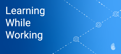
This is the type of dashboard Steve Forman talked about in the Learning While Working podcast on “Measuring the impact of your learning ecosystems.” Steve talked about the difference between tactical learning programs e.g. compliance training and more strategic learning programs. For Steve, a strategic learning program is one that is linked to a business outcome and change in an organisation performance e.g. an improvement in a key performance indicator (KPI). In the podcast, Steve talks about a dashboard approach where the KPI, employee's performance and learning activity are visualised together so the relationship can be seen.
Business metrics |
Performance outcomes |
Learning activity |
|
Employee engagement Retention Means bringing in different data |
Changes in self-assessment Productivity changes Often means more sophisticated approaches to assessment are needed |
Hours Scores When This is the normal focus of learning platforms |
This type of dashboard means that over time you’re able to see how the learning activity is affecting employee’s performance and business metrics. When L&D people talk about stakeholder impact they are thinking about the impact of learning when they are designing approaches to programs. What this approach does to dashboards is to place the focus on impact another step forward and provide a way to track the progress of the impact.
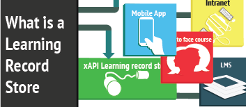
This type of dashboard is normally not possible to build in an LMS because it means bringing in data from other systems. xAPI (if xAPI is new to you check out the post on “What is a Learning Record Store?”) is one way to make these dashboards achievable in learning. Most learning record stores have data visualisation tools. Megan Torrance in the podcast on “What does xAPI mean for instructional designers?” talks about how the impact of learning on business outcomes changes how learning is designed and leads to an exploration of the data which needs to be collected. This often means converting some of your business data into xAPI data. Another approach is to bring learning data into your business reporting systems. This is discussed later in this blog post.
This type of dashboard where the focus is on tracking the impact of learning on business outcomes is what L&D should be moving towards
Using dashboards to gain insights.
The main purpose of this dashboard is to explore data by finding relationships and patterns in the data. In the previous approach, the metrics are fixed and decided as part of the business case and learning design process. In this approach, what is on a dashboard is more flexible and a user can add and remove metrics and filters. Maybe it shouldn’t be called a dashboard because what we’re talking about is having the full flexibility and functions of a report generator. I've included it, as often people think this is what is needed when they think about dashboards.
Technology for building learning dashboards
Exactly how you build your learning dashboards depends on the technologies you have available. Below are three common approaches:
Use your Learning Management System (LMS)
Your LMS is perfect for dashboards that are focused on tracking learning activity. With most LMS you will struggle to build more strategic approach dashboards because most LMS don’t allow you to bring business data into your LMS.
Manually, using a spreadsheet
Often the investment in new tools and the complexity of them doesn’t justify the cost and time. The approach most often used to develop dashboards beyond tracking in a learning management system, is using spreadsheets to enter and format visual data.
Using a Learning Record Store (LRS)
Most learning records stores have some data visualisation tools. Learning Locker (the LRS we use with clients at Sprout Labs) allows you to share and embed dashboards elsewhere e.g. on your Intranet. With this approach, it’s likely you will need to convert your business data to an xAPI format if you want your business data as part of your visualisations. The data visualisation tools in a LRS are not as sophisticated as what you will find in business intelligence tools.
Using a business intelligence tool
As workplaces are becoming more data-driven business intelligence (BI) tools such as PowerBI, Clickview and Tableau are becoming commonplace. One of the key features of these tools is they can bring in data from multiple sources. One of the sources they could bring data in from is your learning platform.
Getting data into most BI systems from a LRS is straightforward and is what many Sprout Labs clients are doing. Most platforms allow you to share and embed visualisations in other platforms. These tools are powerful but they are complex and do have a learning curve.
Becoming data-driven in learning and on a dashboard
Currently there is a lot of interest in data-driven approaches and analytics in L&D. Dashboards are one of the key components to becoming more data-driven and can become a powerful tool for everyone involved in a learning program to track progress and understand the impact of learning on your business outcomes.
Related Pages
Join our newsletter to get new insights into learning
![]()
![]()
![]()
![]()
Sprout Labs acknowledges the Traditional Owners of Country throughout Australia and recognises the continuing connection to lands, waters and communities. We pay our respect to Aboriginal and Torres Strait Islander cultures; and to Elders both past and present.